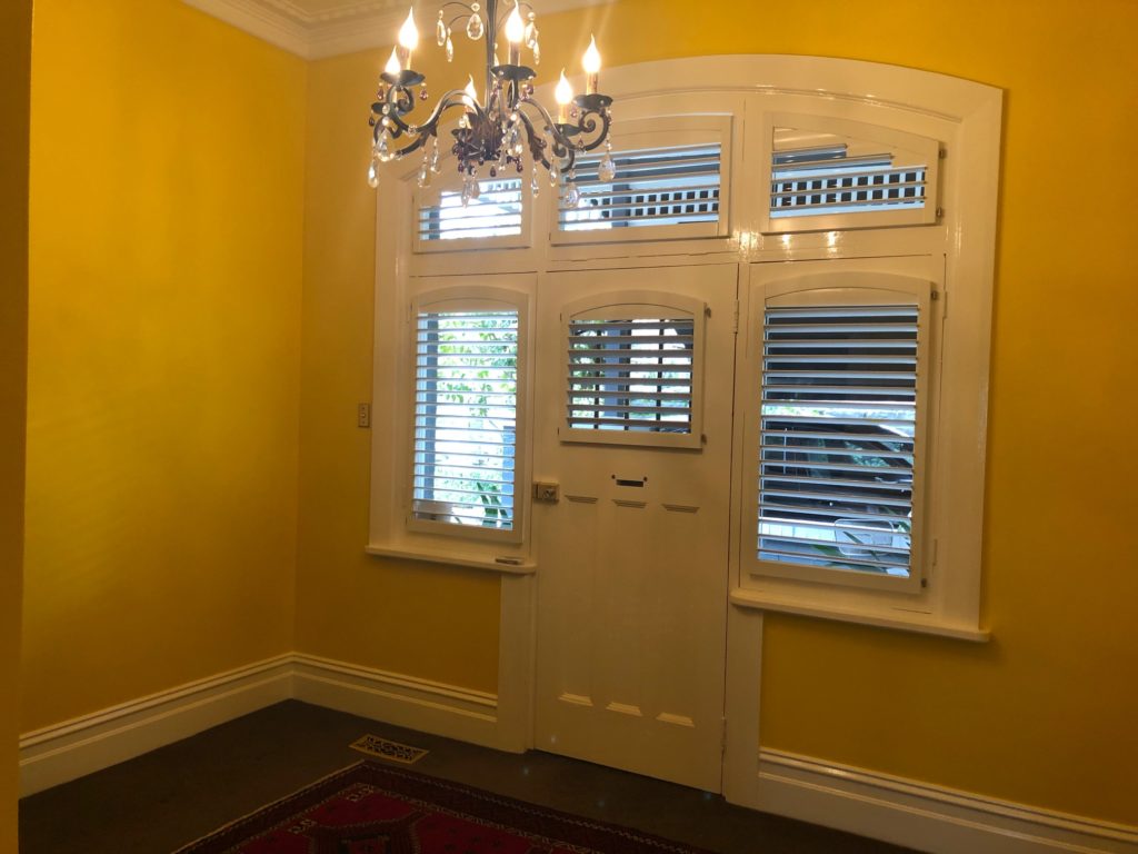
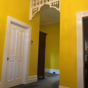
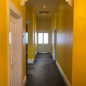
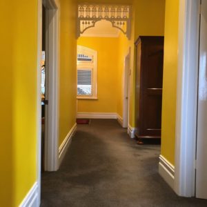
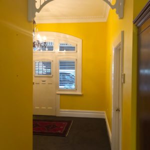
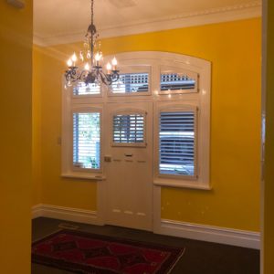
First impressions make a lasting impact and if you think that primary colours can’t do that, then this great looking entrance and hallway will show you why it can. The bright yellow walls project vibrancy, boldness and intrigue as you walk from one end of the hallway to the other, leaving you in no doubt that to choose any other colour than yellow would simply not work in this space. All it took was a little courage from the owner to challenge the notion that all interior painting must be about off white colours.
Scope of Works
The interior painting of the entrance and hallway required that the ceiling, walls, fret work, skirting, doors and architraves be prepared and painted. There was minor plaster repair required above all skirting boards as they were replaced prior to commencement of painting. The air conditioning vents had discoloured and the owner requested for them to be painted the same colour as the ceiling.
Preparation
The preparation involved;
- Minor plaster repair was performed to ceiling cornices, removal of picture hooks and sections of wall
- All plaster repair was sanded, cleaned and undercoated
- Nail holes in skirtings were filled with timber putty and gaps caulked with no more gaps
- All new skirting and existing architraves and doors were lightly sanded and washed clean to remove dust and dirt
- All new skirting was undercoated and spot priming of existing woodwork were coatings were deemed thin and bare
- Air conditioning vents removed, lightly sanded, washed and primed ready for the application of finishing coats to match the ceiling. You can read my post on how to paint ceiling vents here.
Colour Scheme
The colours chosen were; White for the ceiling and for all skirting, fret work, doors and architraves and the walls were coated in Lemon Yellow by Vipond’s. The ceiling was coated with Dulux Professional acrylic in flat, all woodwork was coated in Dulux Super enamel in high gloss and the walls were finished in Vipond’s low sheen acrylic.
Below are some pictures of the completed painting works.
Final Thoughts
I really enjoyed working on this small project due in part to the choice of the colour yellow for the walls. Today, paint manufacturers produce multiple colour charts all of which steer you towards predictable and similar off white colour schemes as well as corresponding stone and neutral feature wall colours. Then one day, you find a client who bucks the narrative and selects a colour that is striking, bold and vibrant and the final result showcases a subtle brightness that greets you when you walk through the front door. So, if this inspires you to step outside your comfort zone, then I’d definitely like to her from you.
